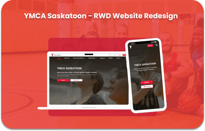
National Archives of Australia - RWD Website Redesign Project
Responsive Website redesign proposed to improve the intuitiveness of research process making the National Archives of Australia’s information easier, and simpler to navigate.
UX Design
Information Architecture
UI Design
- OVERVIEW -
Summary
The National Archives of Australia website holds the memory of Australian history, safeguarding records to help people connect with their stories. This project seeks to undercover UI and UX problems, based on user research. Presenting a responsive website redesign that solves the problems outlined.
Problem
Australian record researchers tend to get overwhelmed by the amount of information, information organization and its navigation, which leads to spending more time, or not completing their research tasks.
Solution
Redesigning a responsive website for the NAA (National Archives of Australia) to assist Australian researchers to discover data and learn about national history in an easier and seamless manner.
Role
UX/UI Designer
Timeline
5 weeks
- DESIGN PROCESS-
The design process began with empathizing with the user, defining the problem statement, ideating, designing wireframes and prototypes, and testing. The inputs from tests led to new ideation, and prototype, emphasizing a non-linear, but a continuously evolving process.
- EMPATHIZE-
-PROTO-PERSONA-
In order to understand the motivations, goals, needs, behavioural demographics, and pain points of typical National Archives of Australia users, a proto-persona was created.
- USER PATH -
Research was also done to discover the typicalUser Path, and the main tasks for NAA's website users. User Path includes mostly to do research and look for data about different topics, such as family history, doing academic research or learning more about Australian history. Users also look for events, exhibitions, and learning opportunities.
(*) Partial User Path - for illustration purposes.
- HEURISTICS EVALUATION-
A heuristic evaluation was conducted, to discover and analyze usability problems with the interface design. Accessibility colour evaluation was also done, verifying the colour contrast and the results of both evaluations were redlined on all pages in the typical user path.
(*) Redline annotation example, the process was done for all the pages related to the main user path
- USABILITY TESTING-
A total of six usability tests were conducted to identify the points of pain associated with three essential tasks, and how they could be improved to achieve a seamless and easier experience. The navigation was also tested with users in the Mobile website version, to gather pain-points using different devices.
- PRIORITY MATRIX-
Using a Priority Matrix the pain points raised on the testing with higher priority (Most important to the user and to NAA) were gathered.
- DEFINE-
After analyzing the results of the heuristic evaluation, the navigation evaluation, the pain points in the different devices navigation and prioritizing the points of highest impact, the problem was defined.
(*) Partial Affinity Diagram
- PROBLEM STATEMENT-
- INFORMATION ARCHITECTURE-
CARD SORTING
A Card Sorting of all primary and secondary pages of the website was done. The sorting approach used 3 stages: Define, Group and Structure.
Step 1 - Define and sort all primary and secondary pages
Step 2 - Creating Groups and New Categories
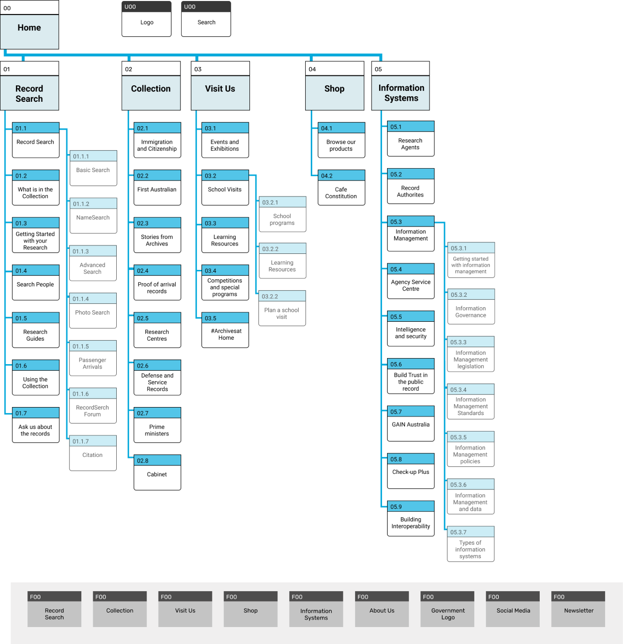
-SITE MAP-
With the card sorting results, a new site map was created, representing a new structure for the primary and secondary pages.
(*) New Sitemap Proposed to NAA
- IDEATE-
Following the analysis of the problem defined and the creation of the new site map, the ideation process was begun. By brainstorming ideas on how to redesign a website that is more concise and intuitive.
After researching inspirations, sketches were first crafted on paper and then transferred to Figma. Focusing first on the HomePage Navigation, and in the main user's path.
(*) Partial Sketch of Ideation Phase
- PROTOTYPE-
An initial wireframe for Desktop and Mobile was created focusing on the homepage, and its navigation. After creating new headers and footers, and thinking on the main user flow, a low fidelity prototype was created.
- WIREFRAMES-
(*) Partial Wireframes for Desktop and Mobile
- TEST-
To validate the solutions created, the low fidelity prototype was tested. Using a 5-second usability testing, 4 tests were conducted. From the insights gathered in these tests, the wireframes were iterated, and structure, navigation and content were validated.
(*) Key insignts from 5 sec - Usability Test
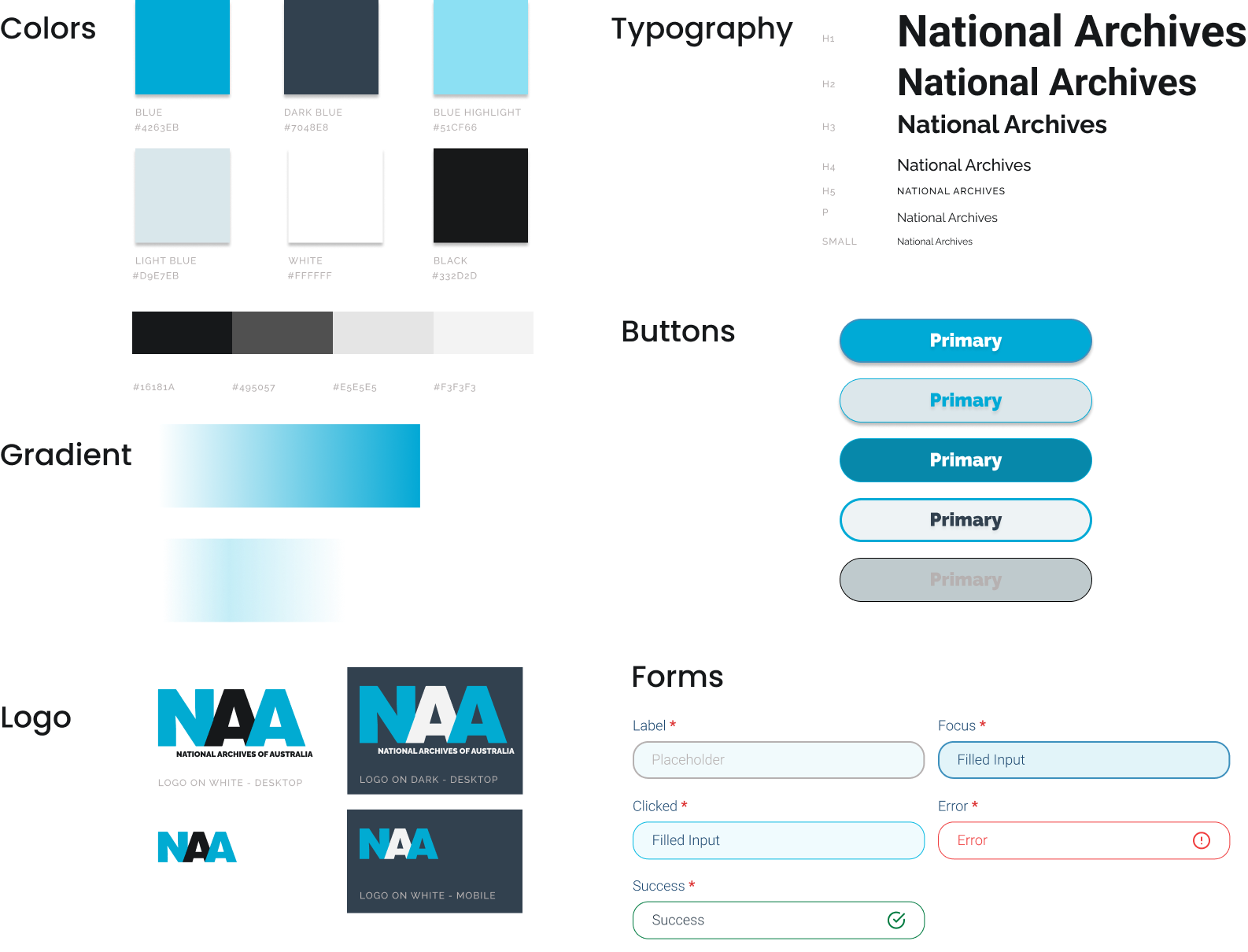
After the adjustment, a UI Style Guide and Tile were created.
- UI STYLE GUIDE -
(*) Partial UI Style Guide for demonstration
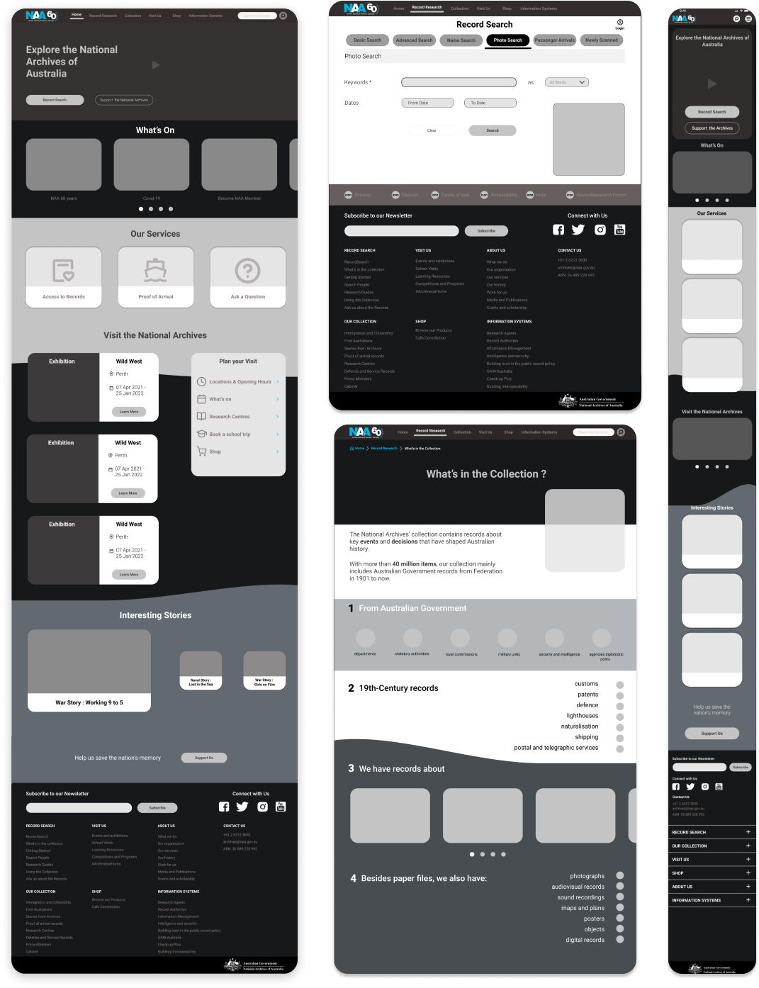
Based on the new UI Style guide, a Responsive High Fidelity Wireframes and Clickable Prototype for mobile and desktop were created.
A New Usability testing was conducted with 8 participants, using the High Fidelity Mobile and Desktop version. To test and validate the usability and to discover whether the experience is easier and more intuitive. That is, looking to confirm if a researcher can complete their main tasks seamlessly.
- USABILITY TESTING -
Through the tests, the solution was validated. One Task achieved a KPI of 82% and the remaining 2 Tasks each achieved 100%, highlighting a few points to adjust and confirming that overall navigation was easy, intuitive, and simple.
(*) Test Recordings Examples
- INTERACTIVE PROTOTYPE -
After considering all iterations and usability tests data, a final interactive prototype for Desktop, Mobile and Tablet was created. Aiming to assist Australian researchers to discover data and learn about national history in an easier and seamless manner.
(*) Desktop Prototype - Preview
(*) Tablet Prototype - Preview.
(*) Mobile Prototype - Preview
- KEY TAKEWAYS-
The importance of consistency, brand identity and information architecture. It was enriching to learn how information organization and structure are crucial to the user experience -
Being exposed to responsive web design was both challenging and rewarding as it emphasized the importance of delivering a good user experience regardless of the device being used.
- NEXT STEPS-
The UI style would need to be applied to the remaining pages, and more tests would need to be taken to evaluate its effectiveness.
More emphasis will be added for the Record Search functionality, that is one of the main paths of the users.
Interested to read more about other projects?
Let’s Connect! I'm looking forward to hearing from you.
